


Curious to see what are some of the most popular website trends for photographers right now?
Photography websites act like online galleries, helping photographers show off their work, connect with clients, and even sell their photos.
Thus, keeping up with the latest design trends ensures your site stays fresh, attractive, and easy to use.
Hey, you’re in an industry where visual appeal and user experience can make or break an online presence (and potential deal).
A well-designed website enhances aesthetics, usability, performance, and searchability.
Recent trends focus on creating immersive experiences, leveraging cutting-edge technology, and simplifying navigation while maintaining a unique artistic identity.
Whether through bold typography, interactive elements, or delicate borders, modern photography websites are evolving to offer more personalized and engaging interactions.
After being involved in the industry for 15+ years, we’ve seen a lot, but here are some of the most impactful trends shaping photography websites today:
Popular Website Trends For Photographers Right Now
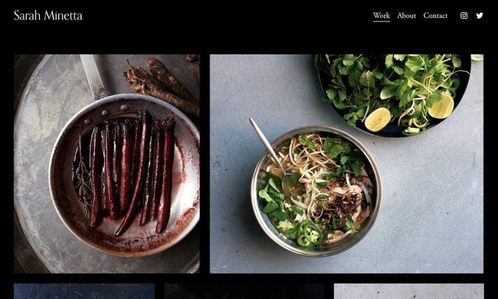
1. Dark Mode & High-Contrast Aesthetic

Dark mode has become a preferred design choice for MANY photography websites.
It offers a modern look while making images pop. We also found that it works fantastically well for any type of photography, including black-and-white.
Moreover, high-contrast elements improve readability and create a notable visual influence. This works even better for showcasing dramatic or moody photography.
Another cool thing is that this design trend reduces eye strain and enhances user experience, particularly in low-light settings.
2. Minimalist Layouts With A Lot Of White Space

Minimalist layouts focus on clean design, reducing distractions so images take center stage.
Meanwhile, generous white space improves readability, guides the viewer’s eye, and creates a sense of elegance.
This approach ensures a clutter-free experience, so navigation through your portfolio is smooth and intuitive.
Friendly tip: When in doubt, opt for minimalism – it’s timeless, elegant, and always effective.
3. Cinematic Full-Screen Images & Videos

A cinematic approach to photography website design ensures a professional, polished feel that captivates and retains viewers.
Full-screen images and videos create a compelling atmosphere, instantly drawing visitors into the photographer’s world.
This design choice is ideal for the home page, but you can also apply it to other sections.
Take it up a notch by adding smooth transitions and subtle animations to create a dynamic flow while keeping the attention on the visuals.
Showcase your work in high resolution so everyone goes WOW.
4. Interactive Scrolling & Parallax Effects

Are you looking for ways to make your photography website feel more lively and engaging?
That’s when interactive scrolling and parallax effects come into play.
These smoothly guide visitors through the content, drawing visitors into a pleasant journey.
When used correctly, they enhance storytelling without overwhelming the visuals – which is key.
You want to balance creativity with usability so everyone gets the most out of your website (and feels happy about it).
5. Asymmetrical Layouts & Bold Typography

Asymmetrical layouts add a sense of movement and originality. Why always do what everyone else does?
They create an exclusive visual hierarchy that keeps visitors curious.
In addition, make your content more stimulating by pairing this style with bold (large) typography so key messages pop more.
We believe that a photography website with this combination instantly has more personality.
6. Immersive Storytelling With Scroll-Based Animations

Scroll-based animations bring images and text to life for more captivating storytelling.
Who doesn’t want to achieve that, right?
As visitors move down your page, elements smoothly transition, revealing content with an irresistible flow. This creates a fluid journey that unfolds seamlessly as they scroll.
When done right, it enhances the emotional impact of your work.
7. Thin Line Elements & Delicate Borders

These soft details refine the design with a touch of sophistication.
Thin line elements and delicate borders discreetly frame content. They ensure images stand out while maintaining a balanced look.
This technique unnoticeably directs attention and guides the viewer’s eye, creating a harmonious viewing experience.
Note: Best in combination with a minimalist layout.
8. Strong Color Detailing & Vibrant Accents

Eye-catching color accents instantly draw attention and add personality to a photography website.
They highlight your key elements without dominating the imagery when you use them sparingly.
Vibrant hues can awaken emotion, create contrast, and boost the overall appearance.
Also, thoughtful color choices help escort visitors’ focus while reinforcing a photographer’s one-of-a-kindness.
Practical Tips For Implementing These Website Trends For Photographers
Before implementing any of the mentioned trends, remember that not all suit every photographer.
Select elements that complement your brand and help you elevate your work.
Here are our tips:
- Start small: You don’t have to overhaul your entire website with these new trends at once. Begin by incorporating one or two that align with your brand and go from there.
- Optimize for speed: Features like parallax effects and full-screen videos look stunning but can slow down your website. Use image compression and caching to keep performance smooth. And for videos, use a YouTube link instead of uploading them directly to your website.
- Maintain balance: While bold typography and vibrant accents are eye-catching, too much can overwhelm your visitors. Use them strategically to create impact without distraction.
- Test on multiple devices: Ensure your (new) design elements look great and function without a hitch across all screen sizes, especially mobile.
- Keep navigation simple: Interactive scrolling and animations are engaging but should never complicate navigation. Visitors should always find what they need quickly and effortlessly.
- Stay consistent with branding: Whether you’re using dark mode, bold fonts, or asymmetrical/uneven layouts, ensure they align with your style.
- Stay true to your identity: With so many design trends emerging, it’s easy to get carried away and lose sight of your brand’s identity. While experimenting with new techniques, don’t deviate from your unique branding and artistic vision.


